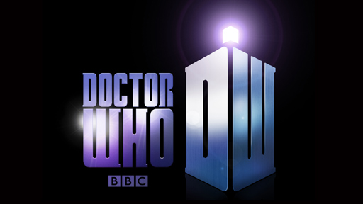
So. What do you think?
Me, I don’t like it. It’s too “clever” in a thought-up-by-marketing kind of way. Someone said “I know. Let’s make the new logo look like the Tardis!” and because he was probably the highest paid ad-exec there (or it was lunchtime) they all thought it was a great idea then pissed off down the pub.
It’s like every other BBC-created logo from the past five years: plasticky faux 3D. I mean, compare the logo above with the previous one for Three:
Or how about the ones for BBC Two from a few years back……….
Both of these (and countless others) were fun in their day but things have moved on, and so, it seems, has the marketing team who thought them up. Straight to Doctor Who.
I mean – since when has making a logo look like the thing you’re selling ever worked? Imagine if the Star Trek logo had the text shaped to look like the frickin’ Enterprise, or the letters KFC somehow morphed into a greasy chicken.
And I don’t care how drop-dead gorgeous his new companion is; if she ever called him Dee Dubyah, I will kill someone.
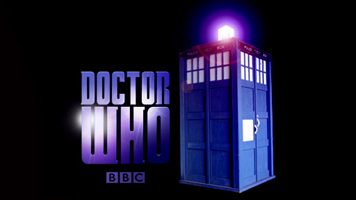
The thing is they could have made it much, much better by just replacing that faux plastic abomination thingy with a simple shot of the battered old Tardis. Nothing fancy. Simple.
See?
Anyhow. That’s my opinion. What’s yours?


Now you’re just “disliking” this coz everyone else does at first…as always. Give it a few weeks into the new series and no one will think of it any more…or grow to like it.
Being a graphic designer is among the most ungrateful professions on the planet and you can’t make everyone happy.
.-= Christa´s last blog ..Have u guys seen the new Dr Who logo yet… =-.
I do like yours more. But hwere is logo going to be used? If it’s during the credits, I’m going to hate it. Otherwsie I don’t mind it, I just don’t see the point in a re-brand when it’s this popular, ‘new start’ or not.
I think it’d be nice if the logo was just the name. The programme and character are that famous that we don’t need reminding about the tardis, but it’d be nice if the name logo reflected the age and history of the character. In that regard, the previous logo that was an updated of the 70’s one was ideal I think.
.-= Dave Wild´s last blog ..Last night a sheep saved my life =-.
Go on, tell me it’s worse then the 1980s logos: http://tardis.wikia.com/wiki/Doctor_Who_logo
I like it, it’s close to the DW novels logo, which is pretty nice. It’s got a more traditional look as well.
For folks complaining about rebrading – it’s already happened three times with minor changes in various ways. Compared to about 8 different TV brandings from the older series, 3 or 4 novel brandings, a distinct DVD branding, different branding on SyFi…
.-= Hammer´s last blog ..Equipment: Hammer’s Big Green Bag of Holding =-.
i like it. i’d suppose the intent is to associate doctor who with an element (the DW by itself) whcih can be used in places too small or restricted for the full logo. the DW-tardis would be easily identified and legible even at small reproduction.